WordPress Blog Layout Guide
A step-by-step layout blueprint for a clean, high-converting WordPress blog
A messy WordPress blog layout makes your content harder to find, harder to read, and easier to abandon. If your posts feel “all over the place” — sidebars packed with random widgets, no clear structure, and clashing fonts — visitors will bounce before they ever notice how good your content is.
In this guide, you’ll turn your scattered posts into a clean, scannable WordPress Blog Layout that works in any modern theme (including Jannah) and focuses on readability, navigation, and conversions. If you’re brand new to WordPress, you can also skim our WordPress guides and tutorials overview to see where layout fits into your overall site setup.
We’ll walk step by step through planning your layout, configuring your blog page, tuning single post templates, cleaning up sidebars, and testing on mobile — all using the Classic Editor and common theme options you’ll find in Jannah and similar themes.
Prerequisites
Before you start rearranging widgets and templates, make sure a few basics are in place:
- A working WordPress site installed and accessible via /wp-admin.
- A theme installed and activated (for example, Jannah) with blog support.
- At least a handful of published posts and categories so you can preview layout changes.
- Admin access to WordPress so you can change settings, widgets, and menus.
Step 1: Define Your Blog’s Goals and Content Structure
Great layouts start on paper, not in the Customizer. If you don’t know what you want visitors to do on your blog, you can’t design a layout that supports it.
- Write down your top 1–3 goals. Examples: grow email subscribers, drive product demo requests, or keep readers on-site longer.
- List your main content types. Tutorials, news, opinion pieces, case studies, etc. This influences how you group content on your blog page.
- Map 4–7 primary categories. These will usually appear in your blog navigation and sidebar, so avoid having dozens of almost-identical categories.
- Decide what a “win” is for each post. Comments, shares, a lead magnet signup, or a click to a product page — this will inform what you place above and below the content.
Step 2: Plan Your Blog Homepage Layout
Your “blog page” (or your homepage if it shows posts) is where layout mistakes hurt the most. Visitors decide in a few seconds whether your blog feels professional and easy to browse.
Recommended layout blueprint
- Top bar / primary navigation: Logo, main site pages (Home, About, Services, Contact) and a clear “Blog” link if your blog is not the homepage.
- Category or topic navigation: A horizontal menu or “Topics” bar so visitors can filter posts quickly.
- Featured section: 1–6 highlighted posts (recent, popular, or manually curated) arranged in a grid or hero + smaller cards.
- Main post loop: A clean vertical list of posts with featured image, title, date, category, short excerpt, and a clear “Read more” link.
- Sidebar (optional): Search, categories, recent posts, key lead magnet, and maybe one social proof or offer — not 20 different widgets.
- Footer: Newsletter signup, secondary navigation, and contact or social links.
Step 3: Configure Blog Page and Archive Settings in WordPress
Now it’s time to make WordPress show your posts in the right place. You’ll configure which page is your blog, how many posts show at once, and how archives behave.
Set a dedicated blog page
- In your WordPress dashboard, go to Pages → Add New and create a page called Blog (leave the content area empty and publish it).
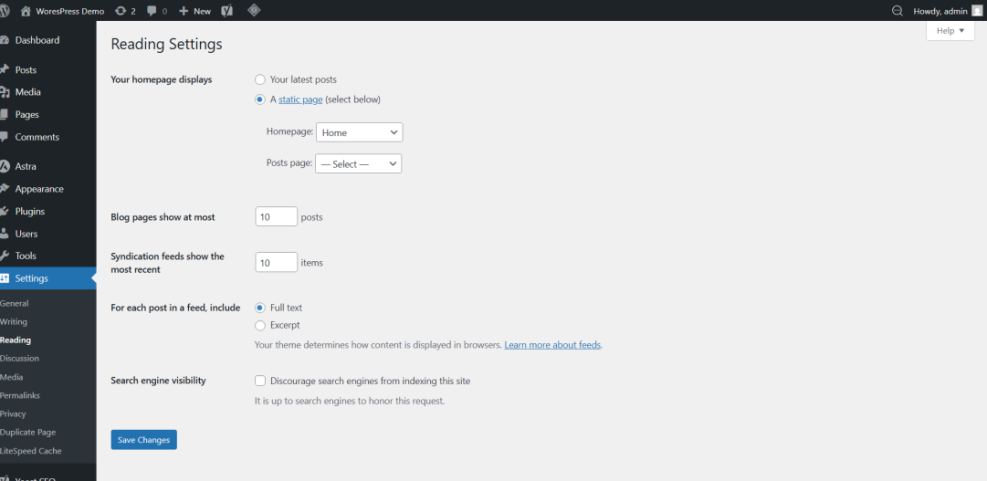
- Go to Settings → Reading.
- Under Your homepage displays, choose:
- A static page
- Homepage: your main landing page (for example, “Home”)
- Posts page: your new “Blog” page
- Set Blog pages show at most to 8–12 posts. This keeps pages shorter and faster to load.
- Click Save Changes.
Adjust how archives display posts
Many themes (including Jannah) offer archive layout options such as list, grid, or masonry.
- Go to Appearance → Customize (or Jannah → Theme Options if your theme has its own panel).
- Look for Blog, Archive, or Layout sections.
- Choose a layout style that matches your content:
- List view: best for long-form content and tutorials.
- Grid view: best when visuals are strong and posts are shorter.
- Mixed / featured + list: strong option for magazines or news-style blogs.
- Set whether to show full content or excerpt on archive pages (use excerpts for faster scanning and better performance).
Step 4: Design Single Post Layout for Readability
Most of your reading time happens on single post pages. A good WordPress Blog Layout prioritizes comfort: clear typography, generous spacing, and predictable placement of meta info and CTAs.
Use a clean heading hierarchy
In the Classic Editor, select your subheadings and assign them as Heading 2 or Heading 3 instead of just bold text. This creates a visual hierarchy and helps screen readers and search engines understand your content structure.
- Open a post in Posts → All Posts → Edit.
- Highlight a section title (for example, “Step 1: Install Your Theme”).
- Use the Paragraph dropdown in the Classic Editor toolbar and choose Heading 2.
- Use Heading 3 for subsections inside those main sections.
Optimize content width, font size, and spacing
Ideal line length for readability is about 50–80 characters per line. If your text stretches edge to edge, it becomes tiring to read. Many themes let you choose “Narrow” or “Centered” layouts for single posts; enable these where available.
If your theme doesn’t offer controls, you can add a simple CSS tweak in Appearance → Customize → Additional CSS:
/* Example: tighten single post content width */
.single-post .entry-content {
    max-width: 720px;
    margin: 0 auto;
}
Pair this with a base font size of around 16–18px and a comfortable line height (1.5–1.8) for the main body text.
Place meta info and CTAs consistently
- Show category, date, and author in a small line near the top (but don’t overshadow the title).
- Use a large, consistent featured image at the top of each post.
- Place your primary CTA (newsletter, lead magnet, product link) near the end of the post and optionally once in the middle.
Once your layout is in place, pair it with strong on-page SEO using the checklist in our beginner guide to optimizing WordPress blog posts.
Step 5: Optimize Sidebars and Widgets
Sidebars can either support your blog layout or completely ruin it. A good sidebar reinforces navigation and calls to action instead of acting as a dumping ground for every widget you’ve ever tested.
- Go to Appearance → Widgets (or Appearance → Customize → Widgets in some themes).
- Identify the Main Sidebar or the sidebar assigned to “Blog” or “Posts”.
- Remove low-value widgets like tag clouds, calendar, or multiple overlapping social widgets.
- Add, in order:
- Search widget.
- Categories (show as a list, not a dropdown, and hide counts if they clutter).
- Recent Posts (5–8 items).
- Primary lead magnet / newsletter signup.
- One social proof or featured resource widget if relevant.
- In themes like Jannah, look for options to enable a sticky sidebar so key widgets remain visible as users scroll.
Step 6: Improve Navigation for Blog Discovery
Good navigation is part of your layout. If visitors can’t jump between topics easily, they’ll click back to search — even if your design looks great.
Build a focused blog menu
- Go to Appearance → Menus.
- Create or edit your Primary Menu.
- Add your Blog page and 4–7 key categories as menu items.
- Drag the category items under the Blog link or place them directly in the main menu, depending on your theme’s header space.
- Assign this menu to the Primary or Main location.
For step-by-step navigation setup, you can follow this beginner guide to WordPress menus and navigation while you build your menu structure.
Use breadcrumbs where possible
- Enable breadcrumbs in your theme options or SEO plugin if available.
- Make sure the breadcrumb path includes Home → Blog → Category → Post (or similar), which improves both UX and SEO.
Step 7: Test Your Blog Layout on Mobile and Performance
Even a beautiful desktop layout can fail if it’s cramped or broken on mobile. Since most visitors now browse on phones, mobile layout checks are non-negotiable.
Test your layout on different devices
- Open your blog page in a desktop browser.
- Use the browser’s developer tools “device” mode to preview common screen sizes (iPhone, Android, tablets).
- Check that:
- Text remains readable without zooming.
- Images resize correctly and don’t overflow the screen.
- Sidebars either stack below content or are hidden gracefully on small screens.
- Menus collapse into a clear, usable mobile menu.
Keep performance in mind
- Limit the number of posts and images on each blog page.
- Avoid heavy sliders or carousels above the fold when possible.
- Use a caching plugin and image optimization plugin to reduce load times.
- Remove unused widgets and plugins that inject layout elements you no longer need.
Faster, cleaner layouts keep visitors moving through your content instead of waiting for pages to load.
Wrap Up Your WordPress Blog Layout Strategy
A strong WordPress Blog Layout isn’t just about looking pretty — it guides visitors from your headlines to your most valuable content and ultimately to your calls to action. By planning your structure, configuring your blog page, refining single post templates, and taming sidebars and navigation, you create a blog that feels intentional rather than accidental.
As you publish new content, periodically review your layout: Are key categories still correct? Do your CTAs still match your goals? Is the design still fast and readable on mobile? Treat layout as an ongoing process, and your WordPress blog will stay clear, professional, and conversion-friendly as it grows.
Further Reading
- WordPress business blog content strategy
- Content planning workflow for WordPress blogs
- Beginner guide to WordPress categories and tags
- Best free WordPress blog themes
Frequently Asked Questions
What if my theme doesn’t have the layout options you describe?
Why does my blog layout look broken on mobile devices?
How many posts should I show on my blog page?
Does changing my blog layout affect SEO?
Are sidebar widgets or scripts a security risk?